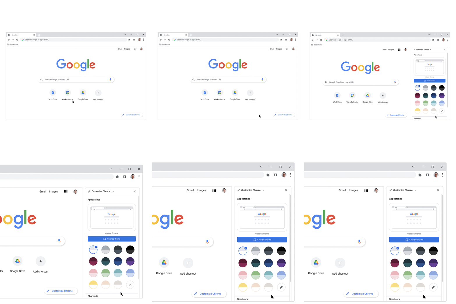
Chrome’s blinding-white interface is nothing worthy of objection, but if you find it a little bland (perhaps even boring), you’ve been able to customize the look for a while now. A small button called Customize Chrome that appears at the bottom right of every new tab lets you make tweaks. And now it’s gotten even easier to spice up your browser’s look.
As The Verge reports, clicking on Customize Chrome now opens a sidebar with preset color schemes and theme options. It’s a neater, less intrusive interface, and one that allows you to see the effects of your personalization decisions more concretely compared to before.

For color schemes, you have 14 to start with, but you can pick your own hues as well. Meanwhile, digging into the themes starts you off with 12 categories, and you can also upload your own art or head to the Chrome Web Store for additional choices. (You can even find matching themes to pair with Gmail’s presets, if that’s your jam.) The current lineup includes expected offerings like landscapes, cityscapes, and geometric art, but also commissions from Asian & Pacific Islander, Native American, LGBTQ+, Latino, and Black artists, with new collaborations to come later this year. Can’t decide on a specific piece of art within a category? You can flip a toggle that will cycle daily through the selections.
You can also adjust a couple of other elements that appear in a new tab, too—the shortcuts and cards that appear under the search bar. If you don’t like seeing them, you can turn them off completely, or change which type appears. While Chrome’s customizations don’t go deep, they do let you add some of your own touch to software you use daily.
Stay connected with us on social media platform for instant update click here to join our Twitter, & Facebook
We are now on Telegram. Click here to join our channel (@TechiUpdate) and stay updated with the latest Technology headlines.
For all the latest Technology News Click Here
For the latest news and updates, follow us on Google News.
